


Your website’s colors are more than just aesthetics; they are a powerful tool for branding, mood-setting, and user experience. Are your WordPress colors truly reflecting your vision and brand identity? Many WordPress users feel limited by their theme’s default colors or are unsure how to make comprehensive changes. This can be frustrating when you want your site to stand out.
Fortunately, WordPress offers various methods to change WordPress colors, empowering you to create a visually stunning and highly functional website. This comprehensive guide will walk you through the best ways to adjust colors, from beginner-friendly options to advanced techniques, ensuring your WordPress site perfectly matches your aesthetic and functional goals.
You will learn about utilizing the WordPress Customizer, applying custom CSS, leveraging child themes, and even exploring the modern Block Editor and Global Styles.
WordPress Color Customization: Your Foundation for Design
Customizing the colors on your WordPress site goes beyond just making it look good. It plays a crucial role in shaping your online presence.

Why Customize Your Site’s Appearance?
- Enhance Site’s Appearance: A visually appealing website attracts and retains visitors. Thoughtful color choices can transform a generic layout into a captivating digital experience.
- Reinforce Brand Identity: Consistent use of WordPress theme colors across your site helps build brand recognition and trust. Your color scheme should resonate with your brand’s message and values.
- Create a Unique Look: With thousands of WordPress themes available, customizing theme colors helps your site stand out, making it memorable and distinct.
Want Pro-Level Color Customization Without the Hassle?
Let WPServices handle your WordPress styling so your brand always looks sharp.
Key Customization Tools Overview
WordPress provides several powerful tools for color customization, each suited for different levels of control and complexity:
- The WordPress Customizer: This live preview interface allows you to make visual changes to your theme colors, backgrounds, and other elements in real time. It’s often the first stop for beginners.
- Custom CSS: Custom CSS (Cascading Style Sheets) provides the ultimate precision for granular control and overriding theme defaults. This method requires some knowledge of CSS.
- Child Themes: A theme is the safest and most robust method for extensive modifications, particularly when you want to make significant changes to your theme’s stylesheet without losing them during theme updates.
- Block Editor (Gutenberg) Color Settings: Modern WordPress themes often leverage the Block Editor, allowing you to control individual blocks’ colors directly within your content.
- Global Styles (for Block Themes): A newer and powerful way to manage site-wide colors, typography, and layout within block-based themes, offering a centralized approach to styling.
Knowing when to use which method is key to efficient and effective color customization. The Customizer is excellent for quick, visual changes. Custom CSS is your friend for specific tweaks or overrides. A child theme is essential for deep, future-proof modifications. The Block Editor and Global Styles offer immense power for modern theme control.
Also Learn: How Can Experiments in Elementor Transform Your Website Design
The WordPress Customizer: Your Go-To for Quick Color Changes
The WordPress Customizer is arguably the most user-friendly way to change WordPress colors. It offers a live preview of your modifications, allowing you to see the impact of your color settings immediately.
Accessing the Customizer
To access the Customizer, log in to your WordPress dashboard and navigate to Appearance → Customize. This action launches the Customizer interface, which typically has a sidebar of options on the left and a live preview of your site on the right.
Navigating Color Settings
The available color settings within the Customizer vary significantly depending on your installed theme. Many themes will have a dedicated “Colors” or “Colors & Backgrounds” section. Here, you might find options to adjust colors for:
- Site-Wide Elements: These include the overall background color of your site.
- Specific Theme Elements: These could include primary theme colors, link color, heading colors, button colors, and more.
- Color Palettes: Some themes offer pre-defined color palette options that you can choose from, providing a quick way to apply a cohesive color scheme.
Using the Color Picker
The color picker is a fundamental tool within the Customizer. When you click on a color option, a color picker tool appears, allowing you to select a color visually or by entering specific color codes.
- Visual Selection: Dragging the cursor within the color picker allows you to choose a color and adjust its shade and tone.
- Color Codes: For precise control, you can directly input HEX codes (e.g., #FF5733), RGB values (e.g., rgb(255, 87, 51)), or HSL values. If you have specific brand colors, entering their HEX codes ensures accuracy.
- Accessibility Safety Net: A valuable feature of the Customizer’s color picker is that it often warns if your chosen text and background colors have insufficient contrast, helping you maintain website accessibility.
Saving Your Changes
Once satisfied with your adjustments, remember to click the “Publish” or “Save Changes” button, typically located at the top of the Customizer sidebar. This will apply your new site’s colors to your live website.
The Customizer provides a quick way to customize the colors of your WordPress site. While it offers convenience, its limitations depend entirely on your theme’s built-in options. For deeper control, you may need to explore other methods.
Read More: How to Manage Site Identity in Elementor
Creating a Strategic Color Palette: More Than Just Pretty Hues
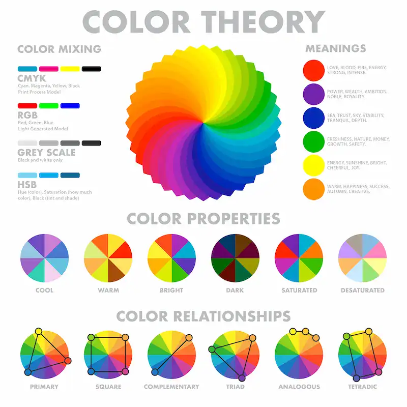
A color palette is a cohesive collection of colors that work well together to create a visually appealing design. It’s the blueprint for your site’s color scheme, going beyond individual color settings to ensure harmony and purpose.
Why a Well-Designed Palette Matters
- Visual Appeal & Harmony: A thoughtful color palette creates a balanced and aesthetically pleasing appearance for your WordPress site.
- Brand Recognition: Consistent colors across your website reinforce your brand identity, making your business more recognizable and memorable.
- Usability & Accessibility: A strategic color scheme can significantly enhance your website’s usability and accessibility, ensuring content is readable and navigation is intuitive for all users.
- Setting the Mood/Emotion: Colors evoke emotions. Your chosen color scheme can set the tone for your brand, whether professional, playful, trustworthy, or energetic.
Further Reading: How to Display Your Custom Post Types in Elementor
Steps to Create Your Palette
Creating an effective color palette starts with understanding your brand and target audience.
Brand Identity First: Before picking colors, define your brand’s personality, values, and message. What emotions do you want your site to convey? This will guide your color choices.
Basic Color Theory (Simplified): A basic understanding of color theory can be helpful:
- Complementary Colors: Opposites on the color wheel (e.g., blue and orange) create high contrast and vibrancy.
- Analogous Colors: Next to each other on the color wheel (e.g., blues and greens) create a harmonious and calming effect.
- Triadic Colors: Three colors evenly spaced on the color wheel offer balanced contrast.
- Monochromatic: Different shades and tints of a single color create a sophisticated look.
Tools for Palette Generation: Numerous online tools can help you generate and refine your color palette:
- Coolors.co: Quickly generates various palettes and allows you to lock favorite colors.
- Adobe Color: Offers a more advanced interface for exploring color harmony rules.
- Colormind: Can generate palettes from an image or learn from your input colors.
- You can also extract colors directly from your logo or brand assets to ensure consistency.
Implementing Your Palette in WordPress
Once you have your chosen color palette (with specific HEX, RGB, or HSL codes), you can use these colors when using the color picker in the Customizer, applying custom CSS, or defining Global Styles in the Block Editor. Recording your HEX codes is a good practice for consistent application across your site.
Know More: WordPress Emergency Support: What to Do When Your Site Crashes
Beyond the Customizer: Advanced Color Control
While the WordPress Customizer offers a quick way to change WordPress colors, sometimes you need more precision or flexibility. For these scenarios, you can turn to child themes, custom CSS, and the powerful Global Styles in the Block Editor.
Customizing Theme Colors with a Child Theme: The Safe Approach
A child theme is a theme that inherits all the functionality, features, and styling of another theme, called the parent theme. It acts as a protective layer, allowing you to make modifications without directly altering the original theme files.
Why Use a Child Theme for Color Changes?
- Preserves Customizations: When your parent theme receives an update, any direct changes to its files will be overwritten. A child theme keeps your color customizations separate and safe.
- Keeps Your Site Stable: Experimenting with code in a child theme is much safer than modifying a live parent theme. If something breaks, you can easily revert.
- Future-Proofing: It’s the recommended approach for any significant modifications to your theme’s stylesheet or functionality.
How to Create a Child Theme
Creating a child theme can be done manually or with a plugin.
Plugin Method: Plugins like “Child Theme Configurator” can automate the process, making it easy for beginners. Simply install and activate the plugin, and it will guide you through the instructions to generate your child theme.
Manual Method (for advanced users):
- Add a new folder in your wp-content/themes directory (e.g., mytheme-child).
- Create a style.css file inside this folder with specific header comments (including Template: parenttheme-folder-name).
- Create a functions.php file to enqueue the parent theme’s stylesheet and your child theme’s stylesheet.
Once created, activate your child theme from Appearance → Themes in your dashboard. It will initially look identical to your parent theme.
Modifying style.css in your Child Theme
With your child theme active, you can edit its style.css file to change colors. This requires knowing basic CSS selectors. You can access this file via Appearance → Theme File Editor in your WordPress dashboard (though a dedicated code editor via FTP/SFTP is often safer for extensive work).
Further Reading: Top Enterprise WordPress Agencies: All You Need to Know for Success
Adjusting Colors with Custom CSS: Precision and Power
Custom CSS refers to using Cascading Style Sheets to adjust the design of your site precisely. It offers granular control over every element’s appearance, including colors, backgrounds, and more.
When to Use Custom CSS
Use custom CSS when:
- Your theme’s Customizer options don’t cover a specific element you want to customize.
- You need to override existing theme styles with specific code.
- You want pixel-perfect control over the appearance of certain elements.
How to Add Custom CSS
There are a few places to add custom CSS to your WordPress site:
- WordPress Customizer → Additional CSS: This is the easiest and most common place for quick CSS snippets. Go to Appearance → Customize and look for “Additional CSS” at the bottom of the sidebar. You can type or paste your CSS code here and see the live preview.
- Child Theme style.css: For more organized and extensive CSS, adding it to your child theme’s style.css file is best practice. This keeps your code within your theme’s structure.
- Block Editor’s “Additional CSS” for blocks: In modern WordPress themes, you can add custom CSS directly to individual blocks through their settings in the Block Editor.
Explore Further: WordPress Admin Code Optimization Tips to Boost Your Site’s Speed
Finding CSS Selectors
To adjust colors with custom CSS, you must identify the correct CSS selectors for the elements you want to modify. The most effective way to do this is by using your browser’s Developer Tools (usually accessed by right-clicking on a component on your site and selecting “Inspect” or “Inspect Element”). This tool will show you the HTML structure and applied CSS styles, helping you pinpoint the correct selectors.
Practical CSS Examples for Color Changes
Here are some examples of custom CSS you might use:
/* Change the main body text color */
body {
    color: #333333; /* Dark gray */
}

/* Change heading 1 (H1) color */
h1 {
    color: #0056b3; /* Darker blue */
}

/* Change paragraph text color */
p {
    color: #555555; /* Medium gray */
}

/* Change all link colors */
a {
    color: #007bff; /* Bright blue */
}

/* Change link color on hover */
a:hover {
    color: #0056b3; /* Darker blue on hover */
}

/* Change button background and text color (example class: .wp-block-button__link) */
.wp-block-button__link {
    background-color: #28a745; /* Green */
    color: #ffffff; /* White text */
}

/* Change the site's background color */
body {
    background-color: #f8f9fa; /* Light gray background */
}
Remember to be specific with your selectors to avoid unintended changes.
Block Editor (Gutenberg) and Global Styles: The Future of WordPress Design
For those using newer, block-based WordPress themes, the Block Editor (Gutenberg) and its associated Global Styles offer a robust way to manage a site’s colors.
Block-Based Themes: These themes are built entirely with blocks, giving you unprecedented control over every aspect of your site’s layout and appearance.
Site Editor (Appearance → Editor): This is the central hub for customizing block themes. It allows you to edit not just post and page content, but also headers, footers, and other theme templates.
Global Styles: Within the Site Editor, click the “Styles” icon (a half-filled circle) to access Global Styles. This powerful feature lets you:
- Set default colors for various elements across your site (e.g., text, background, link color, headings, buttons).
- Create custom color palettes that are readily available when editing any block.
- Adjust styles for specific blocks, affecting all instances of that block throughout your website.
Global Styles are a game-changer, offering a more visual and intuitive way to manage your site’s color scheme without diving deep into code.
Discover More: Partnering with the Best White Label WordPress Agency
Changing Colors to Enhance Accessibility: Design for Everyone
Accessibility refers to users’ ability to access and use your site regardless of their abilities or disabilities. When you change WordPress colors, prioritizing accessibility is not just good practice; it’s essential for a truly inclusive website.

Why Accessibility Matters
- Inclusivity: Ensures your content is usable by everyone, including those with visual impairments, color blindness, or other disabilities.
- Legal Compliance: Many countries have laws requiring websites to be accessible.
- Better User Experience: An accessible site is easier for all visitors to use, leading to better engagement and lower bounce rates.
Key Accessibility Guidelines for Color (WCAG)
The Web Content Accessibility Guidelines (WCAG) provide benchmarks for website accessibility. For colors, the key recommendations include:
- Color Contrast Ratio: This is crucial. WCAG recommends a minimum contrast ratio of 4.5:1 for standard text and 3:1 for large text (18pt or 24px and larger). This ensures sufficient contrast between text and its background color, making it legible for people with low vision. This applies to buttons, hyperlinks, and any interactive elements with text.
- Don’t Rely on Color Alone: Never use color as the only means to convey information. For example, don’t just use red to indicate an error; also provide a text message. For link color, ensure an underline or another visual cue appears on hover to suggest it’s clickable.
- Consider Color Blindness: Around 8% of men and 0.5% of women have some form of color blindness. Avoid using color combinations that are difficult for colorblind individuals to distinguish (e.g., red and green together for indicators). Test your site’s color scheme in grayscale to see if elements remain discernible.
Tools for Checking Color Contrast
Several free online tools can help you check your color contrast:
- WebAIM Contrast Checker: Allows you to input foreground and background HEX codes and instantly tells you if they meet WCAG standards.
- Browser Developer Tools: Many modern browsers have built-in contrast checkers within their inspector tools.
Practical Tips for Accessible Colors
- High Contrast: Use high contrast colors for text and interactive elements.
- Readable Fonts: Combine good color contrast with legible font choices and sufficient font sizes.
- Avoid Clutter: A clean design with good spacing can enhance readability, even with a strong color scheme.
- Test, Test, Test: View your site on different devices and under various lighting conditions. Ask others to review it, especially those with different visual abilities.
Implementing a Consistent Color Scheme: Professionalism and Polish
A consistent color scheme refers to uniformly applying your chosen color palette throughout your WordPress site. It’s paramount for projecting professionalism, enhancing user experience, and strengthening your brand identity.
The Power of Consistency
- Reinforces Branding: Every page, every element, should speak the same visual language, reinforcing your brand in the visitor’s mind.
- Improves Navigation: Consistent link, button, and heading colors make your site predictable and easier to navigate. Users learn what to expect from different interactive elements.
- Creates a Cohesive and Professional Look: A unified color scheme makes your website appear polished and trustworthy, signaling attention to detail and credibility.
Where to Apply Consistency
Your color scheme should be evident across all key elements of your site:
- Headings (H1-H6): Maintain a consistent hierarchy of colors for different heading levels.
- Body Text: Choose a primary text color that is highly readable against your main background.
- Links: Define a standard link color for unvisited, visited, hover, and active states.
- Buttons: Ensure primary and secondary buttons have distinct but consistent colors and hover effects.
- Backgrounds: Maintain continuity in background colors or patterns.
- Form Fields: Ensure input fields and their labels are visible.
- Call-to-Action Elements: Use an accent color to draw attention to necessary actions.
Strategies for Consistency
- Document Your Color Palette: Record all HEX codes (or RGB/HSL values) for your brand’s color palette. This will make it easy to apply them accurately.
- Utilize Theme Global Styles and Customizer Options: Wherever your theme provides options in the Customizer or Global Styles, use them to set site-wide colors. This is the most efficient way to maintain consistency.
- Use CSS Variables (for advanced users): For advanced customization, CSS variables (–primary-color: #HEXCODE;) can make it easier to change colors across your entire stylesheet from one central point.
- Regularly Review: Review your site’s appearance on different pages, posts, and devices to ensure the color scheme remains consistent and adequate.
Related: Is a WordPress Consultation Right for You: What to Expect and How to Prepare
Best Practices for WordPress Color Customization
Successfully changing WordPress colors involves more than just picking pretty hues. Following best practices ensures your efforts result in a functional, appealing, and practical website.

- Start with Your Brand: Your logo and existing branding should always inform your color choices. Your website is an extension of your brand, and color consistency is crucial.
- Limit Your Palette: While it might be tempting to use many colors, a limited color palette (typically 3-5 primary colors plus a few accent colors) creates a cleaner, more professional, and less distracting design.
- Less is More: Avoid overwhelming users with too many clashing colors. A simple, well-executed color scheme is far more effective than a chaotic one.
- Test on Different Devices and Browsers: Your WordPress site should look great on desktops, tablets, and mobile phones and across various browsers (Chrome, Firefox, Safari, Edge). However, colors can sometimes render differently, so testing is vital.
- Consider User Experience (UX): Do your colors guide users effectively? Do they highlight essential elements? Do they create a pleasant browsing experience? Good color design is intuitive.
- Performance: While colors don’t heavily impact website performance, excessively complex CSS or large background images could. Keep your code clean and optimized.
- Back Up Your Site: Before making any significant design changes, especially those involving custom CSS or child theme modifications, always create a complete backup of your WordPress site. This ensures you can revert if anything goes wrong.
- Review and Iterate: Your site’s color scheme isn’t set in stone. As your brand evolves or trends change, be prepared to review and refine your colors over time. Creating a website is an ongoing process.
Also Read: How to Use Custom Code in Elementor
Conclusion and Next Steps: Your Colorful WordPress Journey
Customizing the colors of your WordPress site is a powerful way to create a unique and engaging design that reflects your brand and enhances the user experience. Whether you are a beginner or an experienced developer, WordPress offers a range of tools to help you change WordPress colors effectively.
Use the WordPress Customizer for quick color adjustments, apply custom CSS for precise control, or create a child theme for safe, lasting changes. Modern block themes offer powerful color management through the Block Editor and Global Styles. Always prioritize accessibility and maintain a consistent color scheme for a professional, cohesive website appearance.
By following these easy steps and tips, you can transform your WordPress site into a visually compelling platform that reinforces your brand identity and provides an exceptional experience for your visitors. Now, log in to your WordPress dashboard, start experimenting with the color picker in the Customizer, consider creating a brand-aligned color palette, and explore the possibilities of customization to make your website truly shine.

