

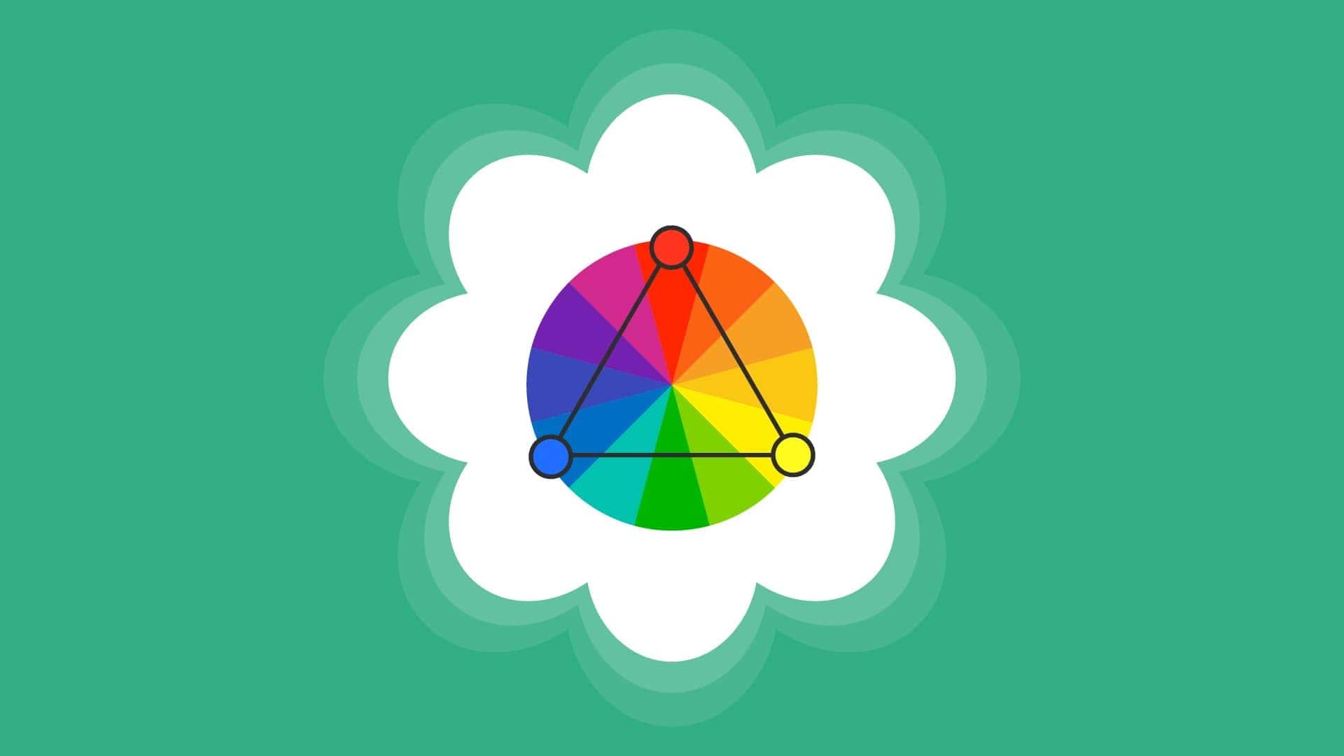
Triadic color palettes is a vibrant and balanced approach to color selection, involving three colors that are evenly spaced around the color wheel. This technique creates a harmonious visual impact by using hues that are distinct yet complementary, providing both contrast and versatility in design.
By choosing colors located 120 degrees apart, a triadic palette can infuse a web design with dynamic energy while maintaining a sense of equilibrium.
Whether you’re designing graphics, interiors, or fashion, utilizing a triadic color scheme can enhance visual interest and cohesion, making it a powerful tool for artists and designers seeking to create eye-catching compositions.
This article will explain what a triadic color palette is and how to use it effectively.
Key Takeaways
- Triadic color palettes consist of three evenly spaced colors on the color wheel, providing a vibrant and balanced visual effect that enhances web design.
- Implement the 60-30-10 rule in triadic schemes to ensure a cohesive and engaging design, with one dominant color complemented by secondary and accent colors.
- Leverage design tools and accessibility checkers to create user-friendly triadic color schemes that not only look great but also enhance usability and inclusivity.
What Are Triadic Color Palettes?
Triadic color palettes are one of the most visually captivating and balanced ways to use color in web design.
But what exactly are they?
A triadic color palette consists of three colors that are evenly spaced around the color wheel, forming a perfect triangle. This even spacing creates a harmonious yet vibrant visual effect that can bring any design to life.

The beauty of triadic color schemes lies in their ability to create a lively visual effect while maintaining balance. Each color stands out, making the overall design feel dynamic and engaging. This balance and vibrancy are why triadic color palettes are a popular choice among designers looking to make a bold statement without overwhelming their audience.
Incorporating triadic color combinations into your design can also evoke a sense of playfulness or highlight contrasts between different elements.
For example, using a combination of royal blue, lime green, and vibrant red can create an energetic and youthful vibe, perfect for a children’s website or a creative agency.
On the other hand, a mix of navy blue, dark pink, pastel purple, and a light blue background can evoke sophistication and elegance, ideal for a high-end brand.
Understanding color theory is essential when working with triadic color palettes. Understanding the relationships between colors aids in combining them for visual harmony. Mastering triadic color schemes allows you to craft stunning designs that convey the right message and evoke desired emotions.
The Science Behind Triadic Color Schemes
The science behind triadic color schemes is rooted in color theory, which explores how colors interact and the emotional responses they elicit.
A triadic color palette is formed by selecting three colors evenly spaced on the color wheel, creating a harmonious and vibrant visual effect. This arrangement ensures that the colors complement each other while maintaining enough contrast to make each color stand out.
Choosing a dominant color is vital in triadic schemes. Awareness of the emotional implications of colors can guide this selection.
For example, bright blue might evoke calm and trust, making it suitable for a healthcare website’s color palette. The dominant color like a dark background sets the tone, while the secondary and accent colors provide balance and highlight important elements.
The three-color rule in web design involves using a primary, secondary, and accent color. This approach maintains visual harmony and prevents the design from becoming overwhelming. Adhering to this rule helps create a cohesive and visually appealing website color scheme that enhances user experience.
Color harmony is crucial in triadic color schemes. Carefully chosen colors create balance and aesthetic appeal. Tools like a Color Picker allow experimentation with different shades to find the perfect combination. The aim is to achieve a beautiful combination that enhances your website’s overall look and feel.
Read about: Color and Effects with Elementor
What is a Color Wheel?
A color wheel is a circular diagram that represents the relationships between different colors. It organizes colors in a way that visually demonstrates how they interact with each other. Here’s a breakdown of its components:
- Primary Colors: The most basic colors on the wheel, typically red, blue, and yellow. These colors cannot be created by mixing other colors.
- Secondary Colors: These are formed by mixing two primary colors. For example, mixing red and blue yields purple; blue and yellow create green; and yellow and red produce orange.
- Tertiary Colors: These colors are created by mixing a primary color with an adjacent secondary color. Examples include yellow orange, red violet, and blue green.
The color wheel is used extensively in art, design, and color theory to help individuals understand color relationships. It aids in creating harmonious color schemes, such as complementary, analogous, and triadic color palettes, by showing how colors can be combined for visual balance and appeal.
Ultimate Guide: Top Digital Asset Management (DAM) Software
Color Psychology: Importance of Color Wheel for Triadic Color Palettes
A triadic color scheme consists of three colors that are equally spaced around the color wheel. These triad colors, such as red, blue, and yellow, help create a visually appealing and harmonious balance by preventing visual overload.
- Integrating Tertiary Colors: To introduce exciting variations, tertiary colors such as blue violet, yellow green, and red orange can be incorporated. Using these nuanced hues can enhance designs while maintaining the visual balance that a triadic combination offers.
- Using Pastel Variations and Lighter Shades: For a softer approach, consider pastel variations or lighter shades in your triadic color scheme. Colors like yellow orange, red violet, and blue green serve as subdued shades, achieving a cohesive blend that avoids overpowering visuals.
- Achieving Visual Balance with Additional Colors: Incorporating a third color, such as golden yellow, can provide additional depth to your palette. This approach complements the dominant hues and aids in achieving a cohesive color palette, enhancing the design’s overall harmony.
- Complementary and Analogous Color Schemes: While triadic schemes are effective on their own, exploring complementary colors or analogous color schemes can introduce compelling contrasts. Consider elements from tetradic color schemes to further enrich and diversify the design.
By understanding and applying these principles, designers can master color psychology and create visually stunning and balanced palettes for any project.
Easy Steps: Best Ways to Change WordPress Colors
Benefits of Using a Triadic Color Palette
One of the most significant benefits of using a triadic color palette is the visually appealing contrast it creates without overwhelming the viewer. This balance makes the overall aesthetic of the website more engaging and enjoyable to navigate.
A well-executed triadic color scheme can enhance visual impact, making brands memorable and their designs more captivating. Other benefits include:
- Improved Usability: Triadic schemes help differentiate website sections, aiding navigation. A dominant color for main content, a secondary for sidebars, and an accent color for buttons can guide user attention. This clarity improves user experience by making information easier to locate.
- Stronger Branding: Consistent use of triadic colors strengthens brand identity through a memorable visual appearance. Applying the 60-30-10 rule ensures a balanced design with one dominant color and two accents.
- Increased Engagement: A well-executed triadic scheme enhances visual impact, making designs more captivating. This attraction draws attention and fosters user interaction, boosting brand engagement.
Mastering triadic color palettes enables the creation of aesthetically pleasing designs that effectively communicate your brand’s personality and values.
Learn: How to Change the Background Color of Your WordPress Website
How to Create a Triadic Color Palette?
Creating a triadic color palette is an effective way to infuse vibrancy and balance into your design. Here’s how to create an effective triadic color palette:
- Select a Primary Color: Begin by choosing a primary color that represents your brand and the emotions you want to convey. This foundational color sets the tone for your design. For example, a tech company might choose bright blue to suggest innovation and reliability.
- Adjust Saturation and Brightness: Modify the saturation and brightness of your selected colors to ensure they complement each other. This step ensures visual harmony and prevents any clashing. Utilizing tools like Paletton can help experiment with various combinations.
- Use Design Tools and Plugins: Implement your color palette using design tools and plugins that facilitate easy application. Platforms like WordPress, with plugins such as Elementor, provide interfaces to consistently apply your color scheme site-wide. Employ color pickers to determine exact hex codes for accuracy and consistency in your visuals.
- Follow the Three-Color Rule: Identify your primary, secondary, and accent colors to maintain a balanced design. This rule helps create a cohesive and aesthetically pleasing scheme that enhances your website’s overall look.
By following these steps, you can develop a triadic color palette that not only beautifies your visuals but also effectively communicates your brand’s essence.
Know more: How to Change Text Color in Elementor
Examples of Triadic Color Palettes in Web Design
Seeing triadic color palettes in action can provide valuable inspiration for your own website color palette design. Let’s explore some real-world examples that showcase the effectiveness of these color schemes.
- Airtable’s logo is a perfect example of a triadic color palette in use. It features a combination of red, yellow, and blue, which conveys energy, creativity, and technology. This vibrant color combination not only catches the eye but also reinforces Airtable’s brand identity as a tool for creative and dynamic project management.
- Another striking example is the Mandai Wildlife Reserve Website, which uses a triadic color scheme of dark green, ivory, and tangerine yellow to create a natural and inviting environment. This palette evokes the lushness of nature and the warmth of the tropics, making it an ideal choice for a wildlife reserve.
- Ilaria Bonardi’s website employs navy blue, white, and warm orange to achieve a modern yet classic look. The navy blue serves as a calming and professional primary color, while the warm orange adds a touch of vibrancy and energy. This combination creates a visually appealing and balanced design that is both sophisticated and engaging, showcasing her own website color scheme.
- Spotify’s website exemplifies a triadic color palette using green, purple, and black. Green, as the primary color, symbolizes freshness and aligns with the creative essence of a music streaming service. Purple accents highlight interactive features, adding a sense of innovation, while black serves as a grounding background, enhancing the visibility of these vibrant colors. Explore this vibrant design at Spotify.
Best Practices for Implementing Triadic Website Color Schemes
Here are some best practices to consider when implementing a triadic color scheme:
- Apply the 60-30-10 Rule: Allocate 60% of your design to the primary color, 30% to a secondary color, and 10% to an accent color. This proportion ensures a structured and visually balanced design that maintains focus.
- Designate a Dominant Color: Choose one color as the main focus and use the other two as supporting accents. This approach keeps the overall design cohesive and uncluttered, aiding in visual clarity.
- Ensure Accessibility: Use color choices that enhance readability for all users, including those with visual impairments. Opt for softer tints or muted variations to ensure text and backgrounds remain readable without overwhelming users.
- Improve Usability: Use triadic colors to clearly differentiate sections of a website, which aids in navigation. This clear differentiation helps users interact with and locate different parts of the site more easily.
Check out: How to Design Your WooCommerce Store for Success
Tools for Designing with Triadic Colors
Designing with triadic colors can be made significantly easier by utilizing various tools that assist in both the creation and implementation of these vibrant color schemes.
These tools cater to different aspects of design, from selecting complementary colors to seamlessly integrating them into your website.

Here are some essential tools for designing with triadic colors:
- Color Selection Tools: The Adobe Color and Coolors platform features a color wheel that helps identify triadic colors by showing complementary hues evenly spaced from your primary color. The wheel also allows for easy experimentation with different combinations to find the ideal palette for your design.
- WordPress Customization: WordPress Customizer enables users to easily change and apply triadic color schemes without needing to code. This built-in feature facilitates seamless color adjustments.
- Astra Theme: It offers extensive customizable options and supports the implementation of triadic color schemes, making it suitable for a wide range of design projects.
- Plugins for Implementation: Elementor plugin and WPBakery Page Builder provide user-friendly, drag-and-drop interfaces with comprehensive customization options. They ensure consistent application of triadic color palettes across your website.
- Advanced Customizer Plugin: This plugin offers enhanced control over color schemes in WordPress, allowing for more detailed adjustments to maintain design consistency.
- CSS Modification Tool: CSS Hero allows users to modify any aspect of their WordPress site’s design, including triadic colors, without requiring coding skills. It provides an intuitive way to implement and tweak your color schemes.
Comparison: Beaver Builder vs WP Bakery
Common Mistakes to Avoid with Triadic Color Combinations
Even with the best intentions, it’s easy to make mistakes when implementing triadic color schemes. Some of these are:
- A common pitfall is overusing vibrant colors, creating a visually overwhelming experience. So, limit strong colors to key elements and use them sparingly to maintain a balanced design.
- Another mistake is not assigning one color as dominant while using the others as accents. Lack of a clear hierarchy can make the design cluttered and confusing. Hence, making one color the primary focus helps create a visually coherent layout.
- Test how triadic colors appear on different devices since what looks balanced on a desktop might not translate well to mobile. Ensure your color scheme works consistently across various screen sizes and resolutions to maintain a cohesive user experience.
By avoiding these common mistakes and following best practices, you can create stunning triadic color schemes that enhance your website’s design.
Testing Triadic Color Schemes for Accessibility
Accessibility is a critical factor when designing with triadic color schemes. Insufficient contrast between colors can make critical elements indistinguishable, leading to poor readability and navigation.
Adequate color contrast is essential for creating a user-friendly website, especially for individuals with visual impairments.
Use color contrast checkers to evaluate the accessibility of triadic color combinations on a website. These tools help determine if your color scheme meets accessibility standards and provides enough contrast for all users. Test triadic color schemes across multiple devices to ensure consistent visibility and engagement.
Testing color harmony confirms that selected colors provide adequate contrast and do not clash. Ensuring your color scheme is accessible to all users, including those with visual impairments, enhances the overall user experience and makes your website more inclusive.
Prioritizing accessibility and testing your triadic color schemes ensures a visually appealing and user-friendly website that meets the needs of all users.
Summary
Triadic color palettes offer a powerful tool for creating visually stunning and balanced web designs. By understanding the science behind these color schemes and following best practices, you can harness their full potential to enhance your website’s aesthetic and usability.
The benefits of using triadic color palettes are numerous. They create visually appealing contrasts, improve usability, strengthen brand identity, and increase user engagement.
By following the 60-30-10 rule and ensuring compliance with accessibility guidelines, you can achieve a balanced and user-friendly design.
Also, tools provide valuable resources for experimenting with color combinations and applying them consistently across your website. In conclusion, mastering the art of triadic color palettes can transform your web design and elevate your brand.
By prioritizing visual harmony and accessibility, you can create a website that is not only beautiful but also inclusive and engaging for all users. Embrace the power of triadic color schemes and take your web design to the next level.
FAQs About Triadic Color Palettes
What is a triadic color scheme?
A triadic color scheme is a dynamic combination of three colors that are evenly spaced around the color wheel, creating vibrant harmony in your designs. Embrace this scheme to add energy and balance to your work!
How does a triadic color scheme benefit WordPress design?
Using a triadic color scheme in WordPress design fosters a visually balanced and cohesive look, making your website more engaging and appealing to users. Embrace this vibrant approach to elevate your design!
What is an example of a website that uses a triadic color scheme?
Duolingo is a great example of a website that effectively uses a triadic color scheme, with its vibrant green, orange, and blue working harmoniously together. Embrace the power of color in your own designs!
What is the 60-30-10 rule in design?
The 60-30-10 rule is a fantastic guideline for balancing color in your design. Use 60% for a dominant color, 30% for a secondary color, and 10% for an accent. Embrace this strategy to achieve a visually appealing and harmonious look!

